

Fed up with the tired and worn out marketing strategies employed by run-of-the-mill agencies, co-founders Freddie and Magnus set up their own design agency SNASK, and set it on a path to “never settle for anything less than super awesome. [They] would do it [their] way, the SNASK way,” in all of their ensuing client work, and that ambition takes its latest shape in a new branding strategy for Sweden’s number one microbrewery: PangPang.
Craft beer enthusiast Fredrik Tunedal tattooed the eponymous “Pang Pang” on his knuckles when he founded the microbrewery at 23 years old, and this past summer of 2014, he wanted to release a beer series that would be sorted out in a new, gorgeous packaging designed by SNASK
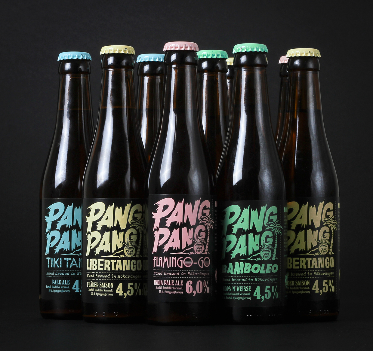
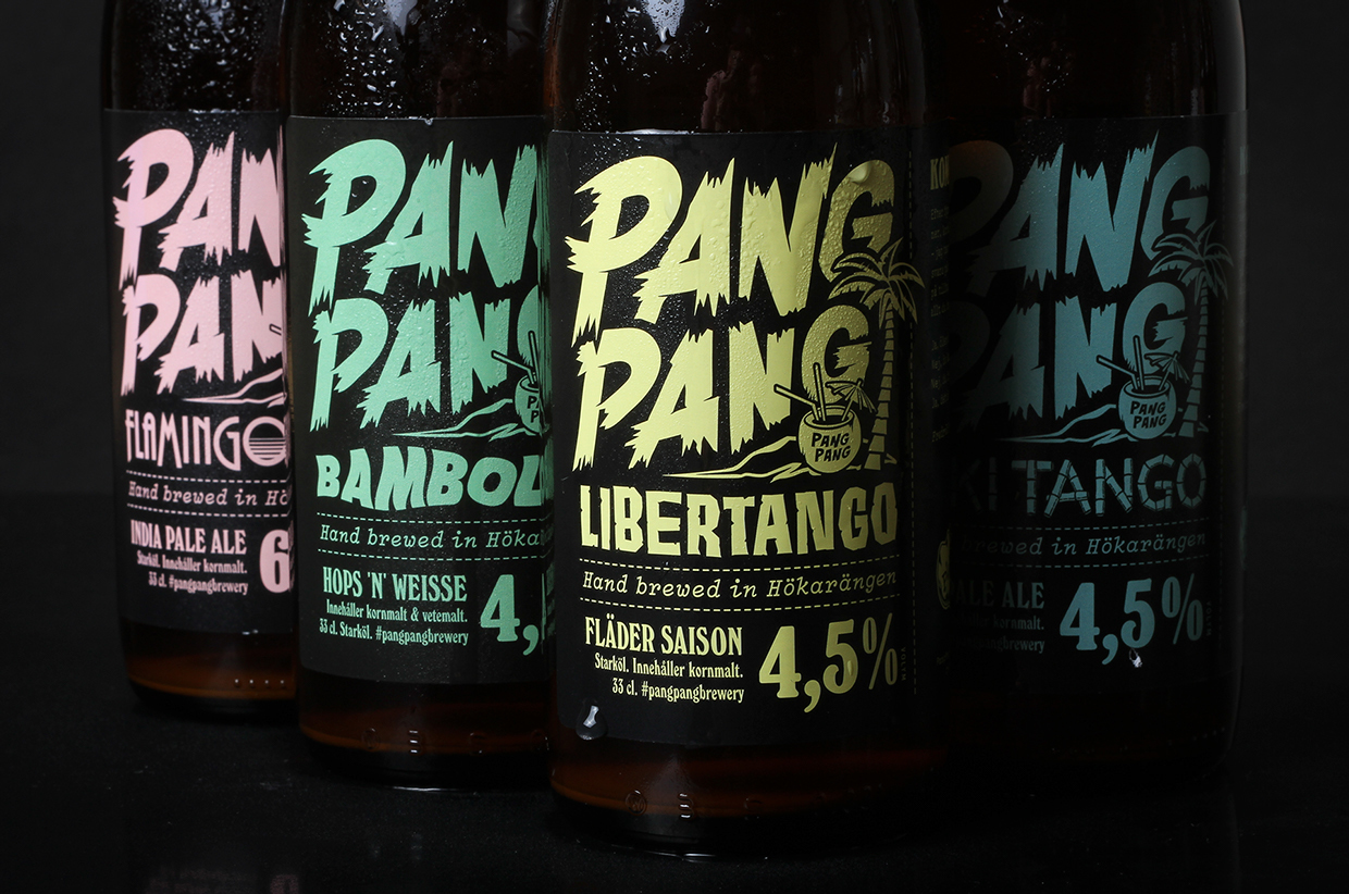
Snask adheres to a simple, straightforward design strategy of smart branding coupled with gorgeous design, and the colors of PangPang’s summer set are very telling in this regard. Blue, green, pink, and yellow are faded out into duller shades of their original iterations, as if sun-bleached, which is perfectly suitable for a summer beer series during which these bottles might very well make an appearance at a beach or a picnic. Ironically, bleaching these colors conveys a youthful vigor and energy–primely located in the air of laid-back relaxation and ease they communicate in turn–that totally fits a field so attuned to innovation and experimentation as modern craft brewing is. The faded colors carry the charm of the vintage and a hipster chic.

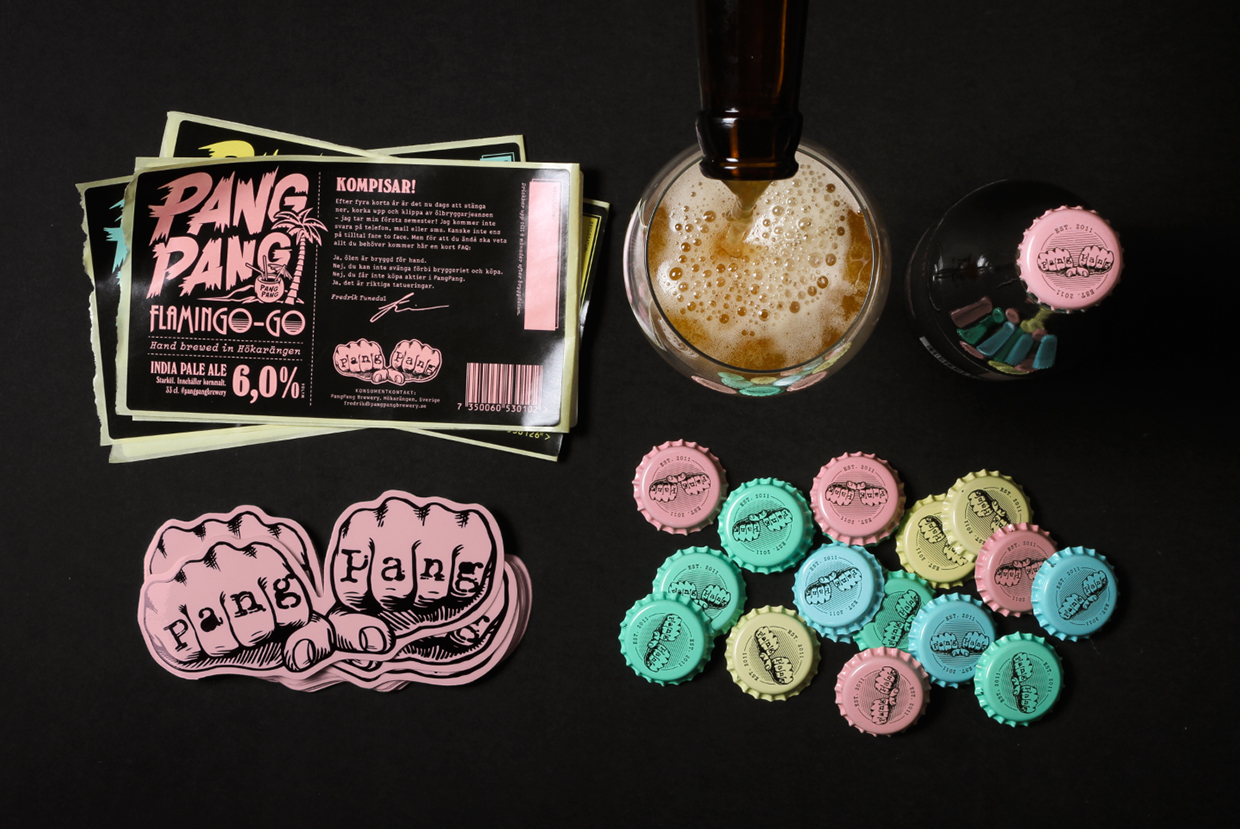
Other elements of the branding scheme are either throwbacks or bold statements, and it’s interesting to see the interplay between these two mentalities. One advertisement shows an animated human hand pouring a bottle of “Bamboleo” into an empty wine glass. This is a witty take on beer sophistication that smiles and nods toward viticulture’s monopoly on that perfidious “S” word, while the advertisement itself is a throwback to stop motion animation. The pink-lettered typography is a bold contrast to PangPang’s hoppier side in the form of their IPA, the “Flamingo-Go,” and the tiny droplets of condensation works on two levels, greatly accentuating the packaging and branding scheme while wetting the appetite for the beverage itself. The pink is a bit of sweetness to the bitter hops of “Flamingo-Go.”
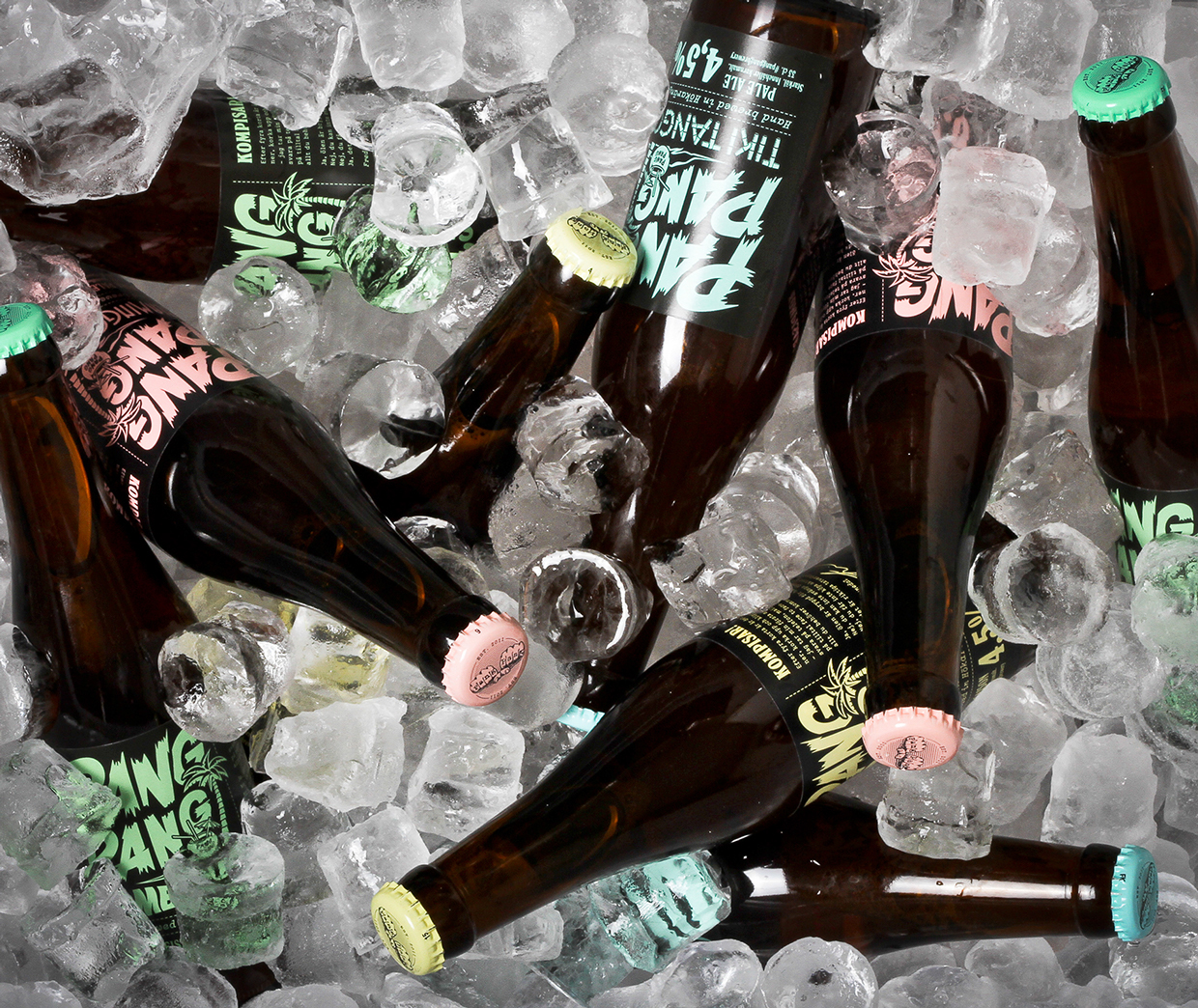
SNASK’s packaging for PangPang is gorgeous in that it downplays the unnecessary and streamlines its colors: caps match the letters, while bottles don’t repeat the same silly catchphrases but are instead typeset with a unique description of what’s inside. The font and names keep with a tropical island feel appropriate to summer, while the simple black backdrops of the photographs leave no room for any show-stealers that would detract from the star of the design: the craft beer. SNASK has truly created a gorgeous vehicle for the beer, by which drinkers can down this alcohol with the biggest smiles possible.
Photography courtesy of SNASK


